Cover letter design templates
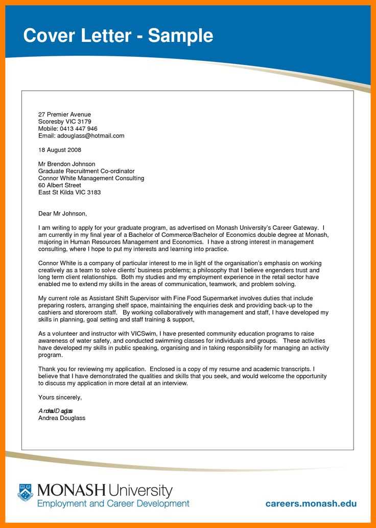
Choose a template that aligns with the tone and style of your job application. A clean, professional design can make your cover letter stand out while maintaining clarity and readability. Select a layout with enough white space to prevent it from feeling cluttered, and keep the focus on your skills and experience.
Tailor the design to suit the industry you’re applying to. Creative roles might benefit from a more unique, visually engaging template, while corporate or traditional fields often require a minimalist approach. Avoid heavy use of colors or flashy fonts, which can distract from your content.
Ensure that your cover letter template includes space for all the key details: your contact information, a concise introduction, an explanation of why you’re a good fit for the role, and a polite closing. Use professional fonts like Arial or Times New Roman for easy readability, and make sure the font size is consistent throughout.
Lastly, proofread your cover letter design to ensure it’s free from any layout or formatting errors. A well-designed letter not only communicates your qualifications but also reflects your attention to detail and respect for the employer’s time.
Cover Letter Design Templates
Choose a clean, modern design for your cover letter that highlights key information without distraction. Prioritize readability by using well-spaced fonts and clear section divisions.
Key Elements of a Great Cover Letter Template
Your cover letter template should include these main sections: header with your contact info, introduction, body paragraphs, and a closing statement. Keep the layout simple and focused.
Choosing the Right Template for Your Industry
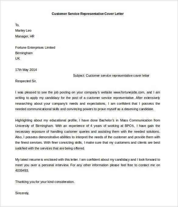
Different industries appreciate different design styles. Creative fields may welcome bold, artistic templates, while corporate environments typically lean towards minimalist, professional designs. Make sure the template reflects the culture of the company you’re applying to.
| Industry | Recommended Template Style |
|---|---|
| Creative | Bold, artistic, with personalized design elements |
| Corporate | Minimalist, structured, with clear sections |
| Technology | Modern, clean, with innovative typography |
| Education | Traditional, formal with a professional tone |
Adjust colors and fonts based on your preferences but avoid overly flashy designs. A well-organized template will make your cover letter stand out for the right reasons.
Choosing the Right Layout for Your Cover Letter
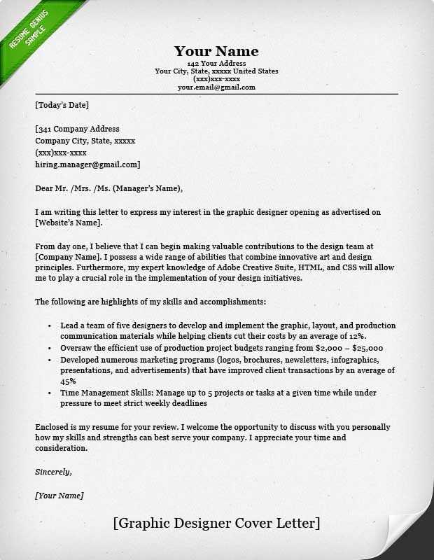
Pick a layout that aligns with the tone of your application. A clean, professional design helps highlight your qualifications while maintaining a formal appearance. Focus on clear sections, such as the header, introduction, body, and closing. Each part should be easy to distinguish for quick reading.
Consider a traditional format if you’re applying for a role in a conservative industry like law or finance. This layout emphasizes readability, with a simple, aligned structure and minimal design elements. It should be centered on the content, with no distractions from excessive styling.
If you’re aiming for a creative position, like in design or marketing, use a more visually dynamic layout. Add subtle design touches, such as borders or color highlights for headings. These can help demonstrate your creative skills while keeping the focus on the content.
Space plays a key role in layout. Make sure the text isn’t overcrowded; adequate margins and spacing between paragraphs enhance legibility. Maintain a balanced ratio between text and white space to avoid overwhelming the reader.
Choose a legible font and stick to one throughout the letter. Avoid decorative fonts that might distract from the content. A classic sans-serif or serif font is a safe choice for most professional settings.
Finally, test how your cover letter appears on different devices or printers. Make sure the layout remains consistent across platforms. A well-organized, adaptable design reflects your attention to detail and professionalism.
Customizing Colors and Fonts to Match Your Profession
Choose colors that align with the personality of your industry. For creative fields like design, arts, or marketing, consider using bold, vibrant colors that express innovation. If you work in finance, law, or consulting, opt for more neutral tones like dark blues, grays, or blacks to convey professionalism and stability.
Colors
For a corporate setting, use subdued colors like navy, charcoal, or white. These shades project reliability and trustworthiness. In contrast, fields such as fashion, media, or tech benefit from the use of accent colors–such as gold, teal, or purple–that capture attention without overpowering the design.
Fonts
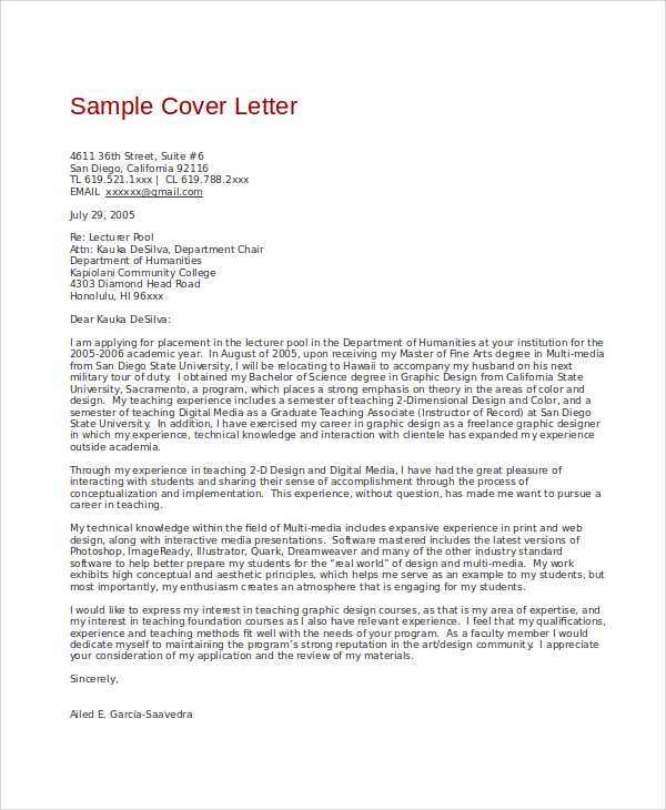
For professions that require precision and clarity, select clean, easy-to-read fonts like Helvetica or Arial. These fonts convey orderliness and professionalism. On the other hand, industries like advertising or digital design can experiment with more modern, artistic fonts like Futura or Gotham to create a sense of creativity and forward-thinking. Keep in mind that readability should always come first, so avoid overly ornate fonts that may be hard to read in smaller sizes.
How to Integrate Visual Elements Without Overcrowding
Keep the design clean by focusing on a few key visual elements. Limit your color palette to two or three tones to create a cohesive and professional look. Using too many colors can distract from the message of the cover letter and create a chaotic appearance.
Choose fonts wisely. Select one or two complementary fonts for headings and body text. Stick with legible and professional fonts like Arial or Helvetica for body text and something slightly more expressive for headings, but avoid mixing too many styles.
Whitespace plays a significant role in making your design breathable. Ensure there is enough spacing between sections, paragraphs, and margins to give your content room to breathe. This helps avoid a cluttered layout and ensures readability.
Icons and graphics can add flair but should be used sparingly. Place icons next to contact details or skills to highlight key information without drawing attention away from the text. Avoid using large, decorative images that overpower the content.
Use borders and lines subtly. A thin, clean line can help separate sections or draw attention to important details, but thick lines or borders around every section can make the document look overcrowded.
- Limit the number of design elements to those that enhance readability or emphasize important information.
- Use colors and fonts consistently across the design to create a unified look.
- Test your design by removing one visual element at a time to assess whether it’s contributing to the overall flow or causing distractions.
Incorporating these principles ensures that the design remains professional, visually appealing, and easy to navigate without feeling crowded.
Creating a Professional Header: What to Include
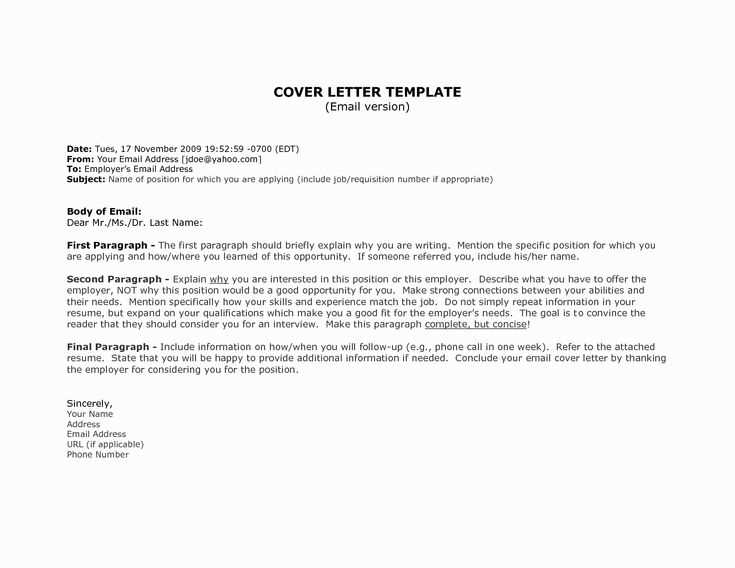
Your header sets the tone for your cover letter. Make sure it immediately communicates who you are and how to reach you. At the top of your letter, include your full name in a large, bold font. This makes it easy for hiring managers to spot your details quickly.
Next, place your contact information below your name. This should include your phone number, email address, and, if relevant, your LinkedIn profile or personal website. Ensure these details are accurate and up to date.
Consider aligning your contact details to the left or center, depending on the layout of your template. Keeping this section neat and organized is key–avoid clutter. If you choose to include a physical address, keep it concise and place it at the top or bottom of the header to avoid distracting from the main content.
Lastly, add the date right beneath your contact information. This shows your letter is current and relevant. The format should be straightforward: month, day, year.
Designing for Readability: Balancing White Space and Content
Prioritize adequate margins around text to avoid clutter. White space doesn’t just separate elements; it gives the reader’s eyes a chance to rest, improving focus and comprehension. A page filled with too much content feels overwhelming, so allowing space between paragraphs, headings, and sections creates a comfortable reading environment.
Use consistent line spacing, ideally between 1.4 and 1.6 times the font size, to increase legibility. Too little space between lines can make text appear cramped, while excessive space might disrupt the flow. Test different line heights to find the right balance based on the font size and the amount of text.
Apply generous padding within text blocks and around images to create breathing room. This makes sections easier to digest and highlights important content without the need for excessive decoration or bold text. Keep your font size readable; 16px is typically a comfortable baseline for body text, but adjust according to your audience’s needs.
Make use of headings and subheadings to break the text into digestible chunks. Space these headings well, and use a larger font size or different weight to clearly distinguish them from the rest of the content. This guides readers through the text without overwhelming them with dense paragraphs.
Avoid too many competing elements. When there’s too much going on, whether it’s excessive fonts or colors, readers struggle to focus on the key message. Stick to a limited color palette and a maximum of two complementary fonts. A clean, straightforward design improves readability and gives each section room to breathe.
Optimizing Your Cover Letter Template for Digital and Print
Adjust your cover letter template to ensure it looks polished in both digital and printed formats. Start with choosing the right file format: PDF is best for digital submission, as it preserves formatting across devices. When printing, use high-quality paper to ensure your template looks professional.
Keep margins consistent. A 1-inch margin works well for both versions, offering balance and readability. Avoid tight margins that can make your content feel cramped, especially on printed copies.
- Font selection: Use standard fonts like Arial, Calibri, or Times New Roman. These fonts are easy to read and look great on both screen and paper.
- Font size: A 10 to 12-point font ensures readability in both formats. Avoid going smaller, as it can be hard to read on paper.
- Line spacing: Use 1.15 to 1.5 line spacing for clear text separation. This applies to both digital and printed versions, enhancing readability.
In digital formats, use hyperlinks for your contact details (such as email and LinkedIn profile), making it easy for the recipient to reach you with a single click. For print, ensure contact details are fully written out to avoid any confusion.
- Headers and subheaders: Organize your cover letter with clear section breaks. Use bold or larger font sizes to distinguish key areas, but keep them simple for easy scanning in both formats.
- Spacing: Maintain a balance between text and white space. This gives your cover letter a clean, organized appearance, whether it’s viewed digitally or printed.
Lastly, check the alignment. Center-align your name and contact information at the top for both formats, and ensure the body text is left-aligned for readability in print and digital versions.