Letter Headed Paper Template for Professional Use
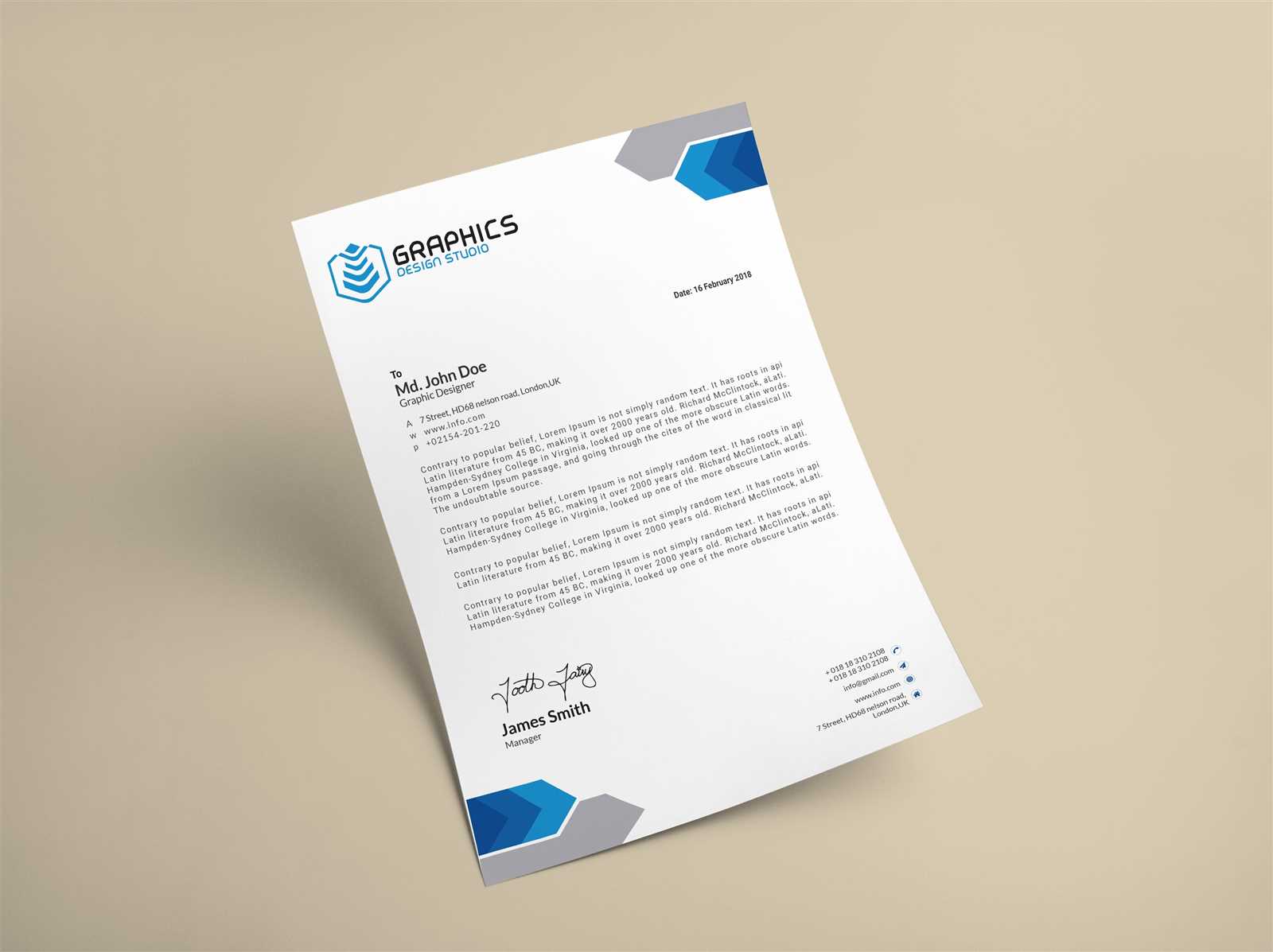
Creating a distinctive and professional appearance for official correspondence is essential for making a lasting impression. Whether for personal or business use, the layout and structure of your stationery can communicate much about the tone and professionalism of your message.
Customizing your stationery allows you to convey a consistent brand image, enhance clarity, and make your communication more memorable. A well-designed document header ensures that key details like your contact information and logo are easily accessible, while providing an elegant and functional structure for the rest of the content.
With the right tools and design elements, you can craft a versatile solution suited to various needs. From adding personalized fonts to selecting suitable colors, each choice contributes to the overall impact of your correspondence. Additionally, choosing the proper format and ensuring high-quality printing further elevates the final result.
Letter Head Design Essentials
Creating an impactful design for official documents requires careful consideration of several key elements that enhance both functionality and aesthetic appeal. A strong design ensures that important details are highlighted, while also contributing to a polished and professional look.
- Brand Identity: Incorporating your company’s logo, colors, and overall visual style is essential for maintaining a cohesive brand image. Consistency in design helps establish trust and recognition.
- Hierarchy and Structure: Proper organization of content is crucial. The placement of essential information such as your name, title, contact details, and logo should be balanced and easy to navigate.
- Typography: The choice of fonts plays a significant role in readability and professionalism. Select clear, legible fonts for the body text and distinctive fonts for headings and key details.
- Spacing and Margins: Adequate white space around text and design elements helps avoid clutter and ensures your document looks clean and organized.
- Quality Printing: High-quality paper and print resolution make a significant difference in the final appearance of your stationery. Choosing the right paper type ensures durability and enhances the overall design.
By focusing on these fundamental design aspects, you can create stationery that not only looks professional but also aligns with the values and image of your brand or business.
Choosing the Right Layout
Selecting the right structure for your correspondence materials is crucial for ensuring clarity and ease of use. The layout sets the tone of the document, guiding the reader’s attention to the most important details and providing a cohesive flow of information.
When deciding on a layout, consider the overall purpose of the document and the key information that needs to be highlighted. The arrangement should allow for a clear presentation of your details while maintaining a professional appearance.
A well-balanced layout typically includes a header section for your logo and contact information, followed by a clean body area for the main content. It’s essential to maintain sufficient margins and spacing to prevent overcrowding, making the document aesthetically pleasing and easy to read.
Additionally, whether you opt for a centered, left-aligned, or top-aligned layout will depend on your personal or brand preferences. Each style offers distinct visual impacts, so choosing one that aligns with your brand identity and the tone of the message is essential.
Customizing Fonts and Colors
Choosing the right typography and color scheme plays a vital role in defining the visual identity of your document. These elements not only enhance the aesthetic appeal but also contribute to the overall professionalism and readability of the content.
Typography is one of the first things readers notice. Selecting a clean, easy-to-read font for the body text ensures clarity, while using a distinctive, perhaps more decorative font for headings adds character without compromising legibility. Pairing complementary fonts can create a balanced and visually pleasing look.
When it comes to color choices, it’s important to maintain a balance. The use of brand colors can enhance recognition, but it’s essential to ensure they do not overwhelm the content. Using neutral tones for the background and applying more vibrant shades for highlights or important details creates a professional contrast.
Subtlety is key when customizing these design aspects–keeping the text readable and the layout visually appealing should always be your primary focus. A well-considered color and font combination will strengthen your brand’s identity and improve the overall user experience.
Incorporating Company Branding
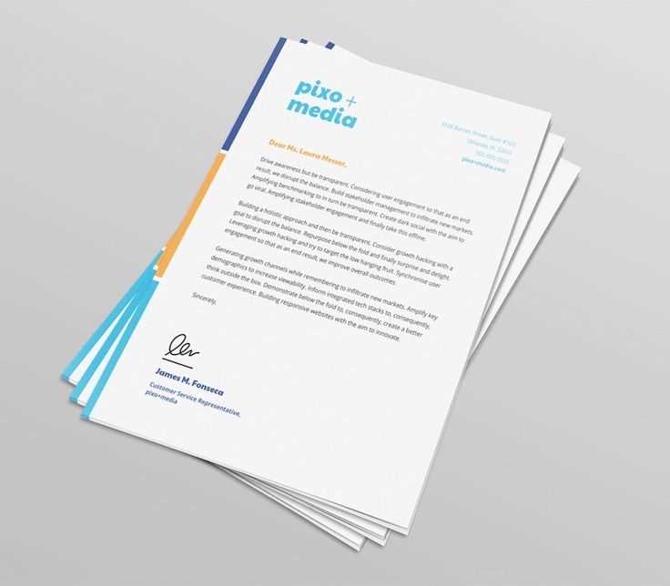
Integrating your brand’s identity into the design of your correspondence materials is essential for consistency and recognition. A cohesive visual presence helps build trust and makes your documents immediately identifiable as part of your organization.
Key Elements to Include
- Logo: The company logo should be placed prominently, typically in the header section, where it can be easily recognized. This reinforces brand identity every time the document is viewed.
- Brand Colors: Utilize your company’s color palette throughout the design. Consistent color use across all materials strengthens brand recognition and creates a unified look.
- Tagline or Slogan: If appropriate, adding a short tagline or slogan near your logo can further reinforce the company’s message and values.
Maintaining Consistency
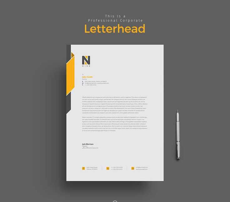
When incorporating branding, consistency is key. Ensure that all design choices–such as fonts, layout, and spacing–are aligned with your company’s established guidelines. This will not only make your materials look professional but also help maintain a unified brand image across all communication channels.
Best Practices for Contact Information
Including clear and easily accessible contact details is crucial for ensuring smooth communication. Properly presenting this information not only makes it convenient for the recipient but also reflects your professionalism and attention to detail.
What to Include
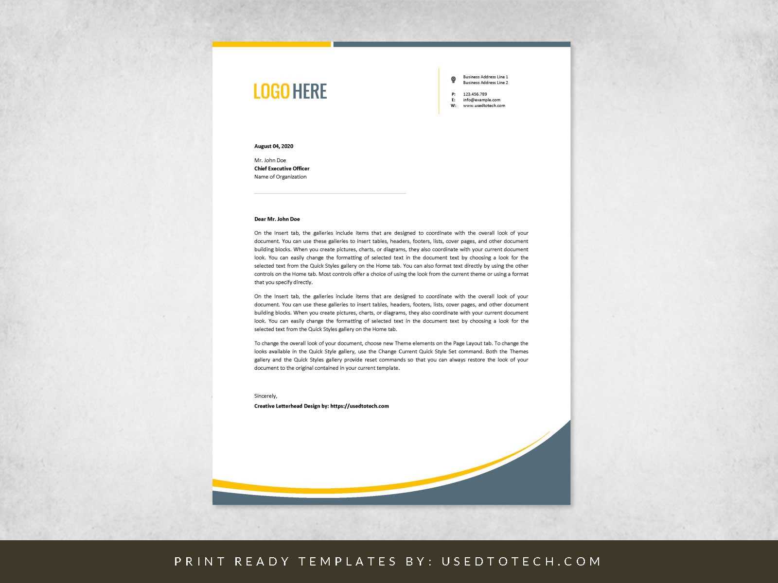
- Company Name: Always feature your company or organization name at the top, ensuring it’s prominent and clear.
- Physical Address: Include your office location, especially if the recipient may need to visit. If you operate online, consider adding a postal address for formal communication.
- Phone Numbers: Provide a contact number for inquiries. If possible, include both a general line and a direct extension for specific departments or individuals.
- Email Address: Ensure an email address is provided for easier communication. Consider a professional, company-specific domain rather than a generic email service.
Layout Considerations
Positioning contact information in the header section ensures it’s immediately visible. However, avoid overcrowding the top of the document. Keeping it clean and organized makes it easier for the reader to locate and use the details without distraction.
Printing and Paper Quality Considerations
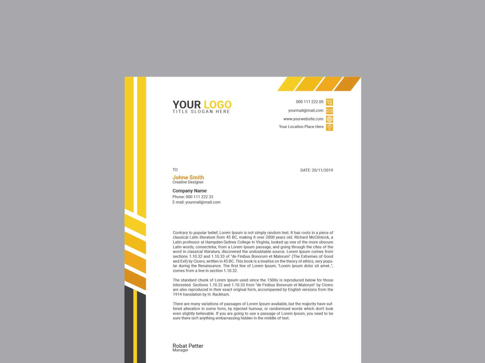
The quality of the final print and the material used can significantly impact the overall appearance and durability of your correspondence. The right choice of paper and print settings not only enhances the visual appeal but also ensures your documents leave a professional impression.
Factors to Consider
- Paper Weight: Heavier paper stock tends to feel more premium and durable, making a stronger impression. Lighter paper is more economical but may feel less substantial.
- Finish Type: Choose between matte, glossy, or textured finishes based on the desired look. Matte finishes are often preferred for formal communications, while glossy finishes are popular for marketing materials.
- Print Resolution: High-resolution printing ensures sharp, clear text and images. Low-quality printing can result in fuzzy text or images, diminishing the professionalism of the document.
Choosing the Right Paper and Print Settings
| Paper Type | Recommended Use | Advantages |
|---|---|---|
| Bond Paper | Standard correspondence | Affordable, good for everyday use |
| Textured Paper | High-end communication | Professional feel, unique texture |
| Glossy Paper | Marketing and promotional materials | Vibrant colors, eye-catching finish |
Choosing the right combination of paper and print settings is key to ensuring your materials reflect the quality and professionalism of your business. Proper consideration of these factors will leave a lasting, positive impression on your recipients.
Free Templates and Tools for Designing
There are many resources available online that can help you create professional-looking materials without the need for advanced design skills. These free tools and customizable designs make it easy to craft documents that align with your brand’s identity and message.
Popular Design Platforms
- Canva: A user-friendly tool with a wide range of customizable layouts and design elements, perfect for creating visually appealing documents.
- Crello: Similar to Canva, Crello offers a variety of free templates, images, and fonts that can help you design professional materials quickly.
- Google Docs: A simple yet effective option for creating clean, straightforward documents. While more basic, it offers easy customization for adding logos and other brand elements.
Design Software for Advanced Users
- GIMP: A powerful, free alternative to Adobe Photoshop, perfect for users who want to create highly customized documents and designs.
- Inkscape: Ideal for vector-based designs, Inkscape allows you to create scalable, high-quality visuals for any document.
By utilizing these tools, you can create visually appealing documents with minimal effort, regardless of your design experience. Many of these options offer both free and premium features, giving you flexibility as your design needs evolve.