Letter Header Template for Professional Use
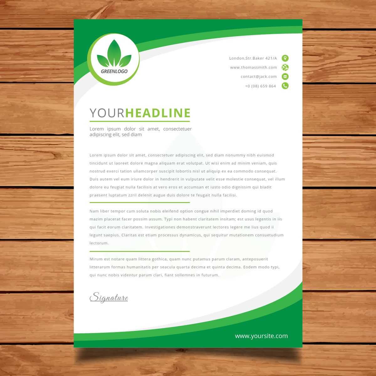
Creating an impactful beginning to a formal correspondence plays a key role in establishing a professional tone. The initial section sets the stage for the reader and helps them understand the purpose of the communication. A well-structured start can significantly enhance the effectiveness of your message.
Key Components for a Strong Start
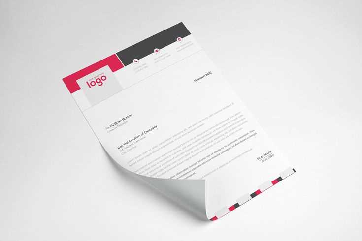
Several elements work together to form a polished introduction. These include your contact information, the recipient’s details, and the date, all of which provide context and set the tone. Additionally, careful attention to placement and alignment ensures clarity and organization, making it easy for the reader to quickly grasp the essential details.
Choosing the Right Style
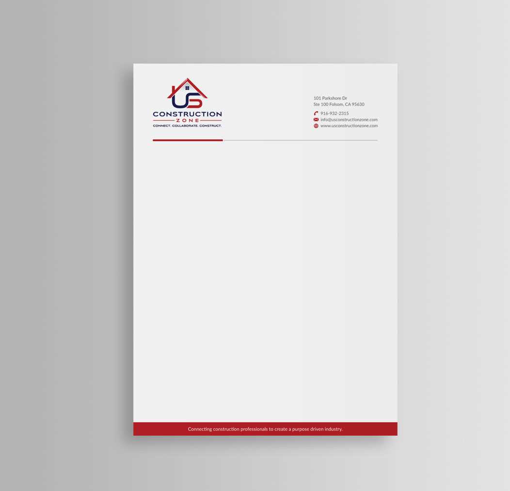
When it comes to the design, opting for simplicity and professionalism is critical. Avoid clutter or overly decorative fonts. A clean, clear style with proper spacing reflects attention to detail and respect for the reader.
Positioning and Alignment
Correct placement of your contact information at the top of the page, followed by the recipient’s details, ensures easy readability. Keeping a consistent format will make your correspondence look organized and credible. It’s essential that the first impression is neat and structured.
Practical Tips for Customization
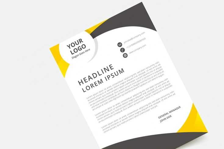
- Use Standard Fonts: Stick to commonly accepted fonts like Arial or Times New Roman for readability.
- Keep it Simple: Avoid overcomplicating with logos or graphics; your content should remain the focus.
- Use Appropriate Spacing: Leave enough space to avoid a crowded appearance but not so much that it looks empty.
Final Thoughts
By following these guidelines, you can create a professional introduction that leaves a lasting impression. The key is maintaining clarity and simplicity, while still providing all the necessary details in an organized manner.
Key Elements for Crafting Professional Correspondence
When preparing a formal communication, certain details must be carefully considered to ensure the document appears polished and respectful. From the visual appeal to the content arrangement, every aspect plays a role in how the message is received and understood. By focusing on the most important elements, you can create a well-structured and visually appealing piece.
Choosing the Right Font for Your Message
Font selection is crucial for ensuring clarity and readability. Opt for simple, clean fonts that are easy on the eyes and appropriate for formal use. Standard fonts such as Arial, Times New Roman, or Calibri are timeless and suitable for most professional scenarios. Keep the size around 11 or 12 points to strike a balance between legibility and space efficiency.
Layout and Formatting Considerations
Arranging the content in a logical and organized manner is key to guiding the reader through your document. Ensure that your contact information, date, and recipient’s details are placed at the top of the page in a consistent and uniform format. Pay attention to margins, spacing, and alignment to avoid a cluttered or disorganized appearance.
In addition, consider utilizing bold or italicized text to highlight important sections, but avoid overusing these styles as they can diminish their impact.
Avoiding Common Mistakes
- Improper Alignment: Ensure all text is properly aligned to avoid an unprofessional look.
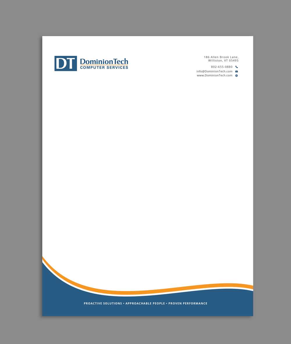
- Excessive Decoration: Keep the design minimalistic and avoid excessive use of color or images.
- Overcrowding the Page: Use appropriate spacing to ensure the document doesn’t feel cramped or difficult to read.
Personalizing Your Communication
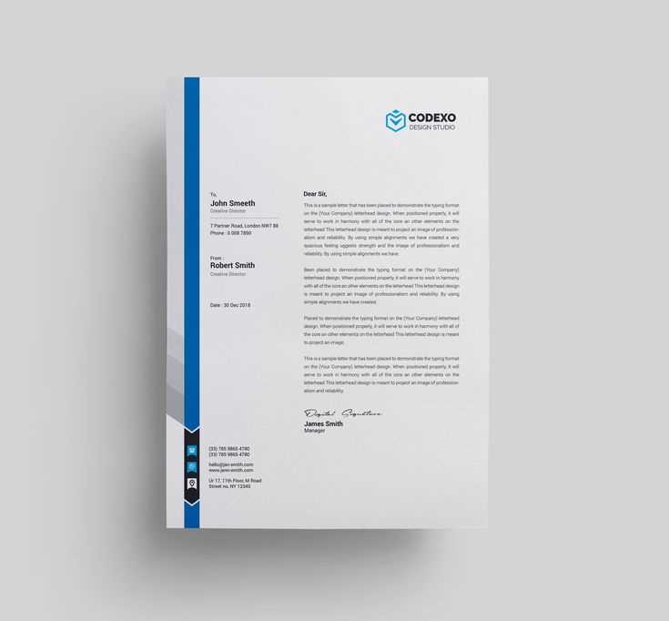
Customization is an important step in tailoring the document to your style. Incorporate subtle design elements such as a personal logo or a unique font to reflect your personality or brand while maintaining professionalism. Adjust the layout to suit the context of the correspondence, whether it’s a formal letter or a more creative approach.