Three letter monogram template
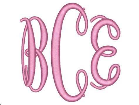
Designing a three-letter monogram requires attention to letter arrangement and font choice. Focus on balancing visual appeal and readability. Follow these steps for creating an impactful monogram template:
Choose the Right Font
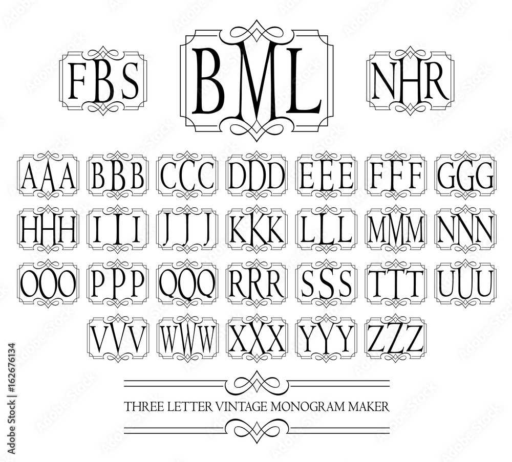
Select a font that reflects the style and personality you want to convey. Serif fonts tend to look classic, while sans-serif fonts are more modern. Script fonts can add elegance and a personal touch.
Consider Your Initials’ Arrangement
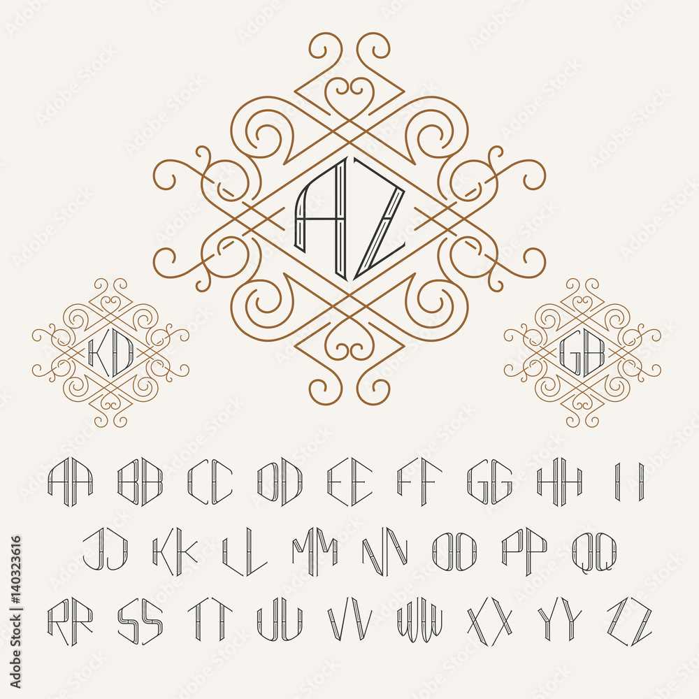
Monograms generally consist of three initials: the first name, the last name, and the middle name. The last name initial is typically placed in the center and is slightly larger than the others. Ensure the letters are evenly spaced to avoid a cluttered appearance.
Use Contrast for Emphasis
Play with contrast to make the initials stand out. Experiment with different font weights, sizes, or colors. The last name initial should be the most prominent, while the other initials remain smaller but still legible.
Test and Refine the Design
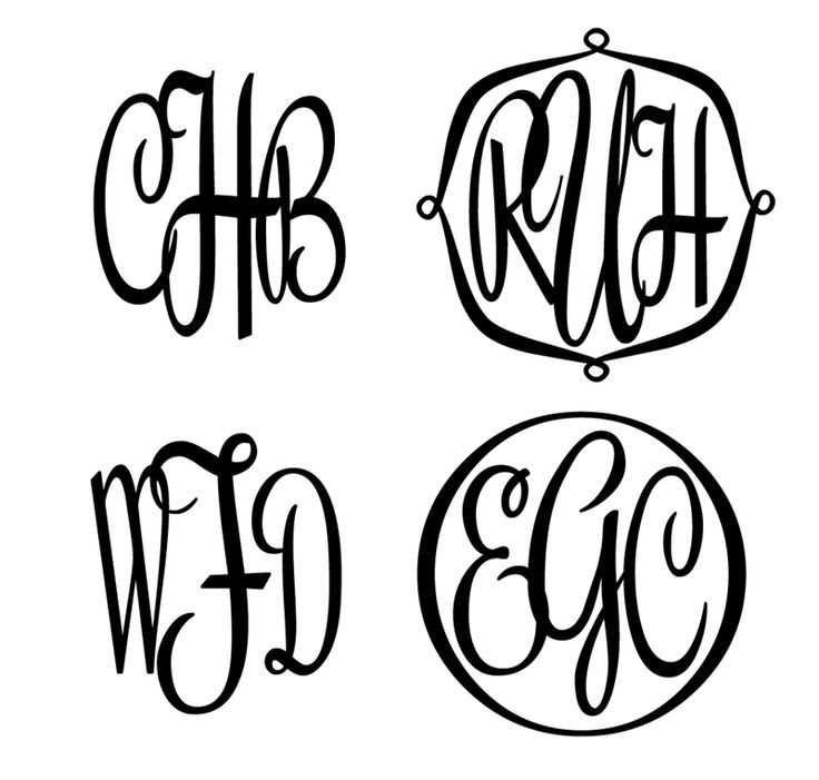
Once you’ve selected the font and arranged the initials, test the design in various formats. Print the monogram or view it on different screens to assess its effectiveness. Make adjustments as needed, ensuring that the letters remain distinct and the design is clear at any size.
Consider Adding Decorative Elements
For a more personalized touch, you can add decorative flourishes, like a border or small icons. Ensure these elements complement the monogram rather than overpower it. Keep the design simple yet sophisticated.
Ensure Scalability
Make sure your monogram looks good in various sizes. It should remain legible when scaled down for business cards or embroidered on clothing, while still being impactful when enlarged for signage or stationery.
Three-Letter Monogram Template
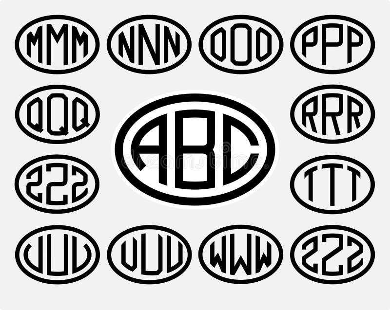
Choosing the right font is key to setting the tone for your three-letter monogram. Look for fonts that match the personality of the individual or brand you’re designing for. Serif fonts bring elegance, while sans-serif fonts convey a modern feel. Script fonts offer a personal touch, perfect for a more stylish look.
To create your personalized three-letter initial, begin by arranging the letters. Place the last name initial in the center, slightly larger than the first and middle initials, which are placed on either side. This traditional arrangement ensures clarity and balance.
Design variations can play a significant role in your monogram. A stacked layout places the initials one above the other, often used for more compact spaces. The side-by-side style, on the other hand, places the initials in a horizontal line, making it ideal for broader designs such as on a bag or a header for a website.
Avoid common mistakes such as using overly complex fonts that may reduce readability, or misplacing the initials in a way that confuses the order. Keep the design simple yet distinctive to preserve both style and function.
Your initials can be applied to various items, from stationery to home décor. For a polished finish, consider customizing items like towels, robes, or office supplies, ensuring the design complements the item’s size and material.
When combining monograms with custom embroidery, ensure the design is simplified enough to translate well onto fabric. Fine details in a font may get lost, so opt for designs that are bold and easy to stitch.