Professional Business Letter Template Design

When composing formal written communication, the way your document looks plays a crucial role in conveying a sense of professionalism and clarity. An organized and polished format ensures your message is not only read but also understood with ease. Proper structuring allows the reader to engage with the content smoothly, while the overall appearance reflects your attention to detail.
Clear layout and thoughtful formatting are key components that can elevate the impact of your message. From spacing to typography, each aspect contributes to how effectively the content is communicated. Whether it’s for client interaction, internal memos, or official notices, the presentation of written communication can significantly influence perception.
In this section, we explore the essential components of a well-organized document. By following a few simple guidelines, you can create correspondence that stands out for its professionalism, while ensuring that the content is clear and easy to navigate.
Key Elements of a Professional Correspondence
Effective formal communication requires specific structural components to ensure clarity and professionalism. These components are designed to guide the recipient through the message, making the content easy to understand and respond to. When properly implemented, they create a smooth flow of information that enhances the overall effectiveness of the message.
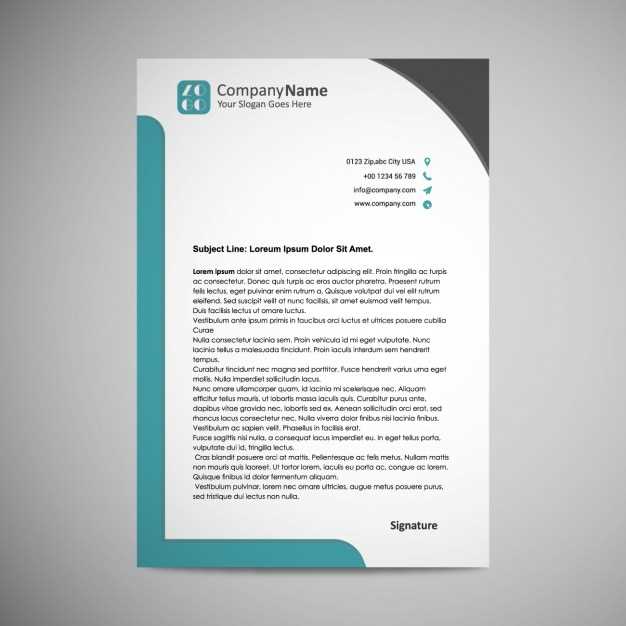
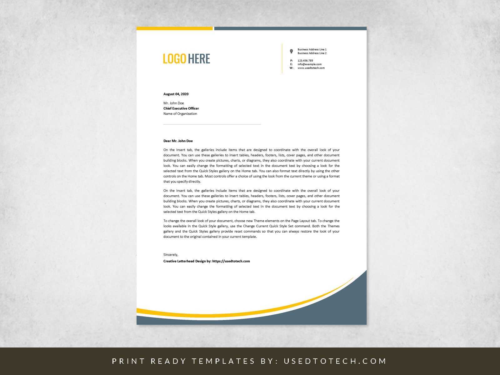
- Sender’s Information: This includes the sender’s name, address, and contact details, typically positioned at the top of the document. It provides clear identification and a point of contact.
- Date: The date when the document was created is important for tracking the timeline and for reference purposes.
- Recipient’s Information: The name, title, company, and address of the recipient help ensure the message reaches the correct person. This element adds a personal touch and shows respect for the recipient.
- Subject Line: A brief line that indicates the purpose or topic of the correspondence. It should be clear and concise, giving the reader an immediate understanding of the message’s intent.
- Salutation: A formal greeting, often starting with “Dear” followed by the recipient’s title and name. The tone of the salutation depends on the formality of the communication.
- Body: The main content of the communication, typically divided into multiple paragraphs. Each paragraph should address one key point or topic, maintaining focus and clarity.
- Closing: A polite phrase or statement that signals the end of the correspondence, such as “Sincerely” or “Best regards.” The closing should align with the level of formality used in the salutation.
- Signature: The sender’s name, often accompanied by their position or title. A handwritten signature adds an extra personal touch, while a typed name suffices for many formal communications.
Each of these elements plays a vital role in creating correspondence that is both professional and easy to read. Following a clear structure allows the recipient to quickly process and respond to the message, which is essential for maintaining smooth communication in any professional setting.
Choosing the Right Format for Correspondence
Selecting an appropriate structure for formal written communication is crucial for achieving clarity and professionalism. The format you choose not only impacts the readability but also sets the tone for the entire message. It helps ensure that all key components are included in the right order, making it easier for the recipient to understand and respond.
Common Formats Used for Professional Communication
There are several popular formats for structuring formal documents, each suited for different types of communication. The most widely used include:
- Block Style: All text is aligned to the left margin, with no indentation at the beginning of paragraphs. This format is often seen as modern and straightforward.
- Modified Block Style: Similar to block style but with the date, closing, and signature aligned to the center or right. It offers a slightly more formal touch.
- Semi-block Style: In this format, paragraphs are indented, and the rest of the document follows the structure of the block style. It combines tradition with modernity.
Factors to Consider When Choosing a Format
When deciding on the structure, consider the following:
- Formality: The level of formality required by the context will influence the choice of layout. More formal correspondence might benefit from a modified block style, while less formal communication may be suited to block style.
- Audience: The expectations of the recipient should also guide your decision. A client or external partner might expect a more polished and structured format, while internal communications can sometimes be more flexible.
- Clarity and Readability: Above all, choose a format that ensures the document is easy to follow. Avoid excessive formatting that can detract from the message itself.
In conclusion, the right structure helps convey your message effectively while enhancing its professionalism. By selecting the format that best fits your purpose and audience, you ensure that your communication is both clear and respectful.
Designing a Professional Correspondence Layout
Creating a polished and well-organized layout for formal documents is essential to ensure the content is easily accessible and professional. A thoughtfully arranged document not only enhances readability but also reflects the sender’s attention to detail and respect for the recipient. The layout should guide the reader through the content smoothly, highlighting key points and maintaining a clean structure.
Key Layout Components
Several elements contribute to a well-designed document, and each plays a specific role in improving the overall presentation:
- Margins: Consistent margins around the document ensure a clean and balanced appearance. Standard margins of one inch on all sides are typically used for formal communication.
- Spacing: Adequate spacing between paragraphs and sections helps break up the content, making it more digestible. Avoid overcrowding the page with dense blocks of text.
- Font Selection: Choose a readable font, such as Arial, Times New Roman, or Calibri, with an appropriate size (usually 10 to 12 points). Consistency in font style and size throughout the document adds to its professional look.
Organizing the Content Effectively
In addition to the visual components, the way information is arranged is equally important. A clear structure allows the reader to quickly grasp the purpose of the communication.
- Headings and Subheadings: Use headings to organize the document into sections. They help break up the content and give the reader a quick overview of the key points.
- Alignment: Proper alignment ensures that the document appears neat and easy to follow. Most professional documents use left-aligned text, while the date and closing can be centered or right-aligned depending on the format.
- Consistent Paragraph Length: Avoid long paragraphs. Break text into manageable chunks to ensure that the content remains engaging and easy to scan.
In summary, the layout of a formal document plays a critical role in ensuring that the message is communicated clearly and professionally. By focusing on clean formatting, appropriate spacing, and logical organization, you can create correspondence that makes a strong and lasting impression.
Typography Tips for Professional Correspondence
Choosing the right typography is essential for enhancing the readability and professionalism of written communication. The way text is presented can significantly impact how the message is perceived. Proper font selection, spacing, and hierarchy ensure that the content is not only easy to read but also communicates the right tone.
Font Selection and Size
The choice of font plays a crucial role in creating a professional and polished appearance. Stick to traditional, easy-to-read fonts such as:
- Serif fonts like Times New Roman, which are formal and widely accepted for official communication.
- Sans-serif fonts like Arial or Calibri, which offer a modern, clean look and are equally suitable for most professional documents.
The font size should generally range from 10 to 12 points. A smaller font size may appear crowded, while larger text may seem informal and unprofessional.
Line Spacing and Alignment
Proper line spacing helps improve readability and ensures the text does not appear too dense. A line spacing of 1.15 to 1.5 is ideal for most formal documents. Additionally, maintaining left alignment for most of the text is the most common and recommended choice, as it is easy to follow and looks clean.
Line length also plays a role in legibility. Ideally, a line of text should not exceed 70 to 80 characters, which helps prevent strain on the eyes and allows the reader to focus without feeling overwhelmed.
Emphasizing Key Points

Using emphasis techniques such as bold and italics can help draw attention to important information. However, be mindful not to overuse these options, as it can detract from the message. Use bold for key terms or headings, and italics to highlight additional context or nuances.
In conclusion, paying attention to typography ensures that your correspondence remains professional, clear, and effective. By carefully choosing fonts, adjusting spacing, and emphasizing key points, you enhance the readability and impact of your message.
Effective Use of Branding in Correspondence

Incorporating your organization’s identity into formal communication not only strengthens recognition but also conveys professionalism. When done right, branding elements subtly reinforce the sender’s values, tone, and image, making a lasting impression on the recipient. Carefully placed logos, color schemes, and fonts can make your message stand out while remaining appropriate and cohesive.
Key Branding Elements to Include

There are several crucial branding elements that should be included in formal documents to maintain consistency with your company’s identity:
| Brand Element | Purpose | Recommended Usage |
|---|---|---|
| Logo | Represents your organization’s identity and adds a professional touch. | Place it in the top header or at the beginning of the document, ensuring it’s not too large or distracting. |
| Colors | Aligns with your brand’s visual identity and enhances recognition. | Use primary brand colors subtly in headers or borders without overwhelming the content. |
| Fonts | Maintains consistency with your brand’s typography and tone. | Stick to one or two fonts that are easy to read, ensuring they align with your brand guidelines. |
Balancing Branding with Readability
While branding elements are essential, it’s important not to overpower the content. The primary focus should remain on the message, with branding serving as a complementary feature rather than the main attraction. For example, using a logo too large or employing bright colors might detract from the formality of the communication. Aim for a subtle integration that enhances the overall appearance without disrupting the clarity of the message.
In summary, branding in formal documents is a powerful tool when used correctly. It reinforces your organization’s identity, fosters recognition, and maintains professionalism. By carefully incorporating your brand’s visual elements, you can create correspondence that is both memorable and effective.
Ensuring Clarity in Your Message
Clear communication is essential in all formal exchanges. When conveying important information, it is crucial that the reader understands the message without confusion. The way the content is structured, phrased, and presented can significantly influence how easily the reader can grasp the intent and key details. Effective messaging requires simplicity, directness, and coherence.
Organizing Your Content
One of the most effective ways to ensure clarity is through proper organization. Breaking the content into logical sections and using clear headings helps the reader navigate through the message with ease. Key points should be presented in a structured manner to avoid overwhelming the reader with information. Bullet points or numbered lists can also aid in highlighting important details, making the content more digestible.
Using Simple and Direct Language
Avoid jargon or overly complex phrases that may confuse the reader. Keeping sentences short and to the point ensures that the core message is conveyed without unnecessary elaboration. It’s important to use straightforward language, particularly when conveying instructions or requests. This reduces the risk of misunderstanding and keeps the focus on the essential points.
By organizing the content effectively and using simple language, you increase the chances that your message will be understood clearly. Prioritize clarity over complexity to make sure the recipient can respond appropriately and efficiently.